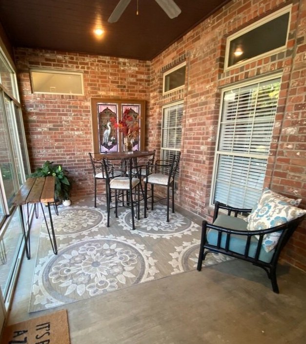
All-season room revamp...

I seriously love this room….

…it stays cool in the summer and relatively warm in the winter. I honestly thought we would spend a great deal of time here.

But we don’t.

When we want to sit “outside” for dinner or drink our coffee in the morning, we always sit on the screened porch.

The “all-season” room has become a place for the litter box and a dumping ground for all my outdoor critter food and seeds.

The rest of the room was still good, but again, we just never used the space like I thought we would.

So I am making a change….

Last week I ordered an outdoor couch. It should be here this week. I moved the big “bar table” to the screened porch, and I decided to corral the critter mess.

I searched Craigslist, flea markets and Marketplace trying to find a credenza/buffet/cabinet type thing I could convert into a storage/“kitty cabinet”….kind of like the one I made for our master bathroom.

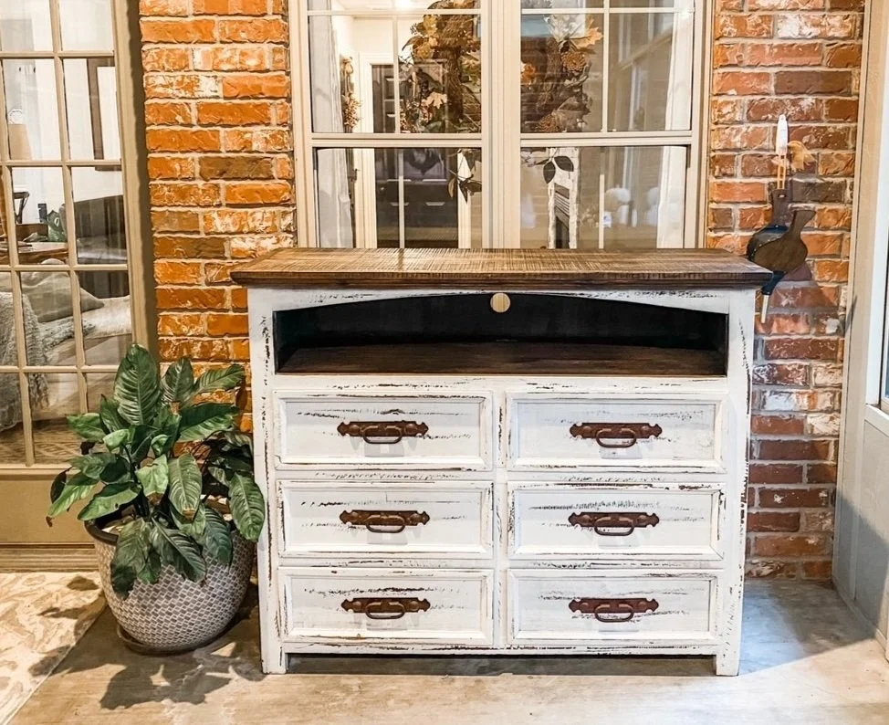
I found this….

I like the “style” well enough in this space, but I am not sure about scale…seems kind of tallish so I may eventually cut it down and eliminate the void space. I think it is meant to be a tv cabinet and that space is for Blueray players or such. Who knows. Again, I kind of like the style for this space, I knew I could convert it for the kitty box and the drawers would give me storage for bird seed and critter food.

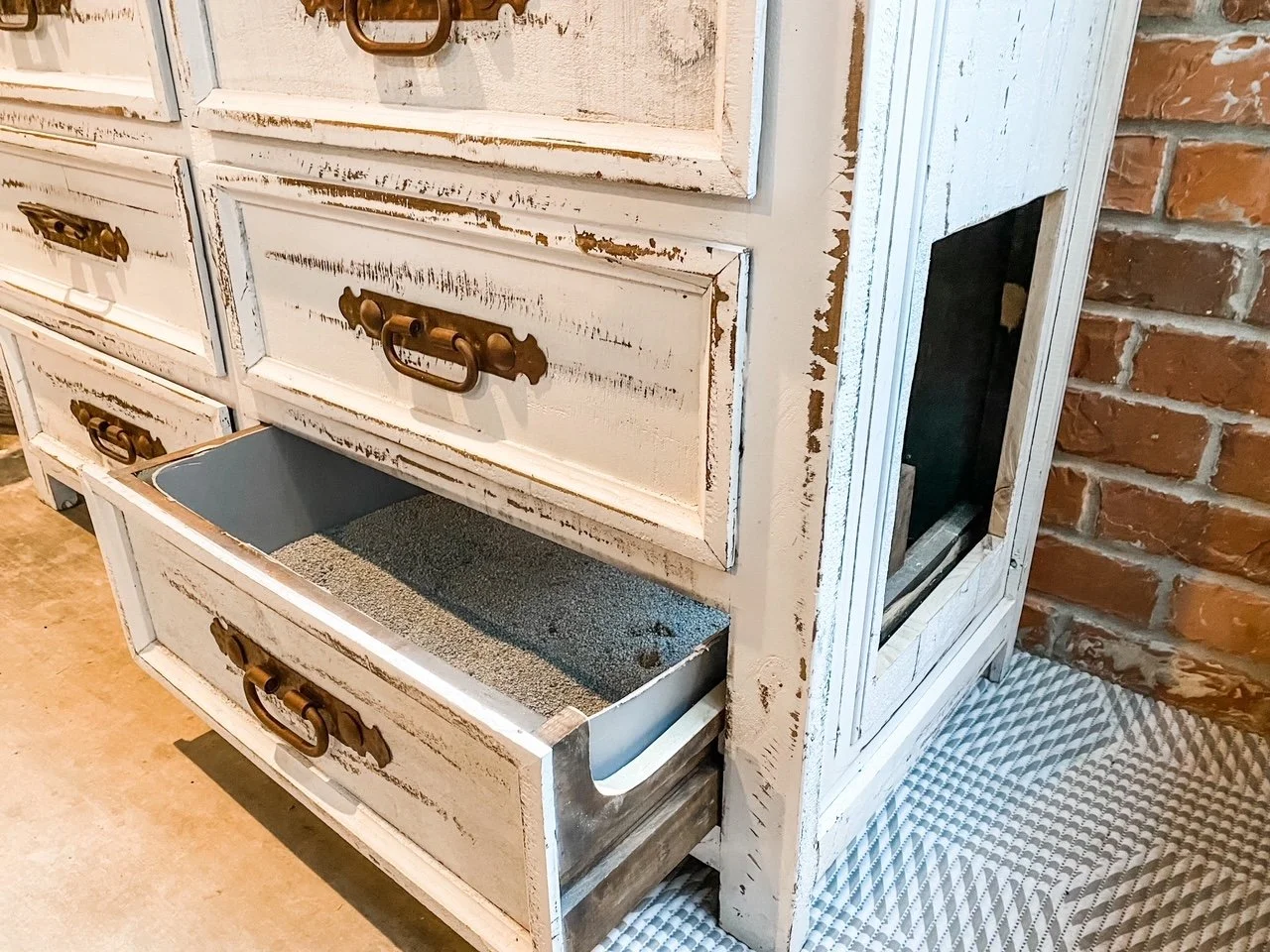
I decided to leave the bottom right drawer intact and just set the litter box in it. It fit perfectly after I cut the height down a bit and I can easily pull the drawer out to clean out the box. I trimmed the side of the drawer down just a tad using a jig saw. I used a skill saw and jig saw to cut a hole in the side for access….

To give the kitties “head room” I had to remove the guts of the drawer above this one and then glue the drawer front back onto the cabinet…so it’s not really a drawer, it just looks like one.

TIP: To glue the drawer front back onto the cabinet, I applied wood glue all around the edges and put a blob of hot glue on each corner. The hot glue quickly sets up to hold the drawer front in place while the wood glue dries.

Again, not sure about the scale of the cabinet but all in all I am pretty happy with it. It sure beats the mess that was there.

Hopefully the new couch will be here this week and we can get the room completed. Again.

Sometimes you have to live in a space for a time before you know what you REALLY need.

Until next week…..

Designing a room....

Everything seems to progressing nicely at the new house…knock on wood! Wood floors are going in, walk in shower is being built, sheetrock repair is being done.

Today I want to talk about “design features.”

As I mentioned before, I kind of “wing it” when it comes to design. Some people need a visual like a design board that shows all the elements of a room.

Me…I find one thing I absolutely love and then go from there.

In the new kitchen, it was this tile….

I can not tell you how much I LOVE this tile. (It was delivered this week…even more beautiful in person!)

I have one space in the kitchen that is about 8’ long…it is the perfect “cubby” for a cooking center…cook top, oven and microwave. My vision is walnut lowers with two painted uppers to the ceiling, walnut floating shelves, white quartz tops, stainless vent hood and this tile.

This tile has a “brushed gold” accent in it so to tie in the gold with the rest of the kitchen I have decided to go with these simple pendant lights above the island….

They kind of coordinate with the light fixture I have in my dining room…the exact same one I have ordered for the breakfast room in the new house.

What can I say, I love what I love!!!

Some really funky gold hardware.

A touch of “whimsy.” I’m not a big “cabinet hardware” person…I don’t even have them on my cabinets here…but I am going with shaker style cabinets and they will need hardware. I just thought these were fun and different.

The appliances are all stainless. I LOVE my black stainless appliances, but I fear that will be one of those “fad” things. I think in the long run I will be happy with stainless. Also, there is Carrara marble accents in the tile backsplash and greyish veining in the quartz tops…I think the stainless will blend right in.

I have a two door/two drawer refrigerator. I went with a side-by-side.

First, I will NEVER buy another Samsung product. Love the other appliances but the ice maker on the fridge hasn’t worked right since the second year… I actually have to go buy ice every week. Evidently it is a “design flaw” not covered by their warranty. Rampant problem and no real fix. Not cool Samsung.

Second, while I love the drawers, I am just getting too old to bend down and dig through a big ole’ drawer for a frozen chicken. I know side-by-sides are not nearly as energy efficient and they aren’t the “in thing” right now, but I loved the one I had years ago so I am going back with one!

I read reviews and decided to go with either Kitchen Aide or Whirlpool. Considering the price difference, I went with Whirlpool.

The bar stools…I have struggled with that one because I have had mine for 20 years and I still love them especially after this little “makeover”…truth is if I needed “bar height” vs “counter height” I would just take them with me.

Unfortunately they are not counter height and they are iron so cutting them down is not feasible… so I had to find new counter height bar stools. The minute I saw these I knew they were exactly what I want….

Super simple and I think the walnut color will tie in beautifully with the walnut base cabinets and floating shelves!

This is my “design board”….I drop pictures of what I like into a computer file…each has at least one element I like. I may not like everything in the picture, but there is one thing in each I am drawn to…

I know I am drawn to walnut cabinets…but I don’t want ALL of them walnut so I am going to have walnut lowers in the “cooking center” and painted uppers. The entire island will be painted. The tops are white quartz with greyish/taupish veining. I was able to go to the quartz place and actually pick out the slabs of quartz I wanted.

Some people HAVE to have a design or “mood” board….

…something that allows them to see every element of their design (This is not my design board, just one I plucked off Pinterest.)

I get it…and it isn’t hard to make…just find what you want on line and drop it into a file, then create a “board” on a program like Photoshop. You are able to see all your elements and determine if they coordinate.

Personally, I can see every detail in my “minds eye.” I wake up at 3 a.m. every morning and visualize every single element. Probably drives my subs nuts because if I “see” something I like, I will text or email them at 4 a.m. with my idea. (Hopefully they mute their phones at night or the “ding” of my text will wake them at this unGodly hour!)

My motto…YOU DO YOU! If you need a design or mood board, go for it. Do what works for YOU! Probably would have been a lot easier on my cabinet guy had I had a design board rather than 30 random pictures of cabinets and kitchens and having to go through each one to show him the one element in each pictures I love. I only hope and pray he has the same vision as I do!

Guess we’ll see in a few weeks. In the meantime I will continue to micro-manage the poor guys who have to work at the house every day…lol!

ANOTHER KITCHEN MAKEOVER....

I did a “mini-makeover” a couple of years ago when I installed a new microwave and stove…

….and last year I finally added a new matching dishwasher.

I also did a little makeover on the dining room last year and I LOVE IT!

I sat on my hands long enough that the “white painted cabinet” craze is slowly dying off. Fortunately I don’t have the dreaded “honey oak” cabinets and still like my cabinets…and truthfully I loved the granite tops when I first installed them.

But for years I have been on a quest for “lighter and brighter” without painting the cabinets.

Two years ago I replaced the black bar top with white quartz…and I have coveted white quartz counter tops since!

I LOVE IT!!! I have Google and Pinterest searched enough to know that I would love white quartz tops with the “paprika cherry” stain cabinets and a travertine backsplash.

To give myself a “visual,” I bought some white shelf liner and white duct tape and covered one entire side of my kitchen with it…just to make sure I would like a “white” counter top.

I LOVE IT!!!

The “visual” really sealed the deal for me.

For several days I debated on whether I should get tops that have “veining” in them or just plain white. I even contemplated going back to the shop and picking up a few samples of quartz with some movement (the unique pattern of patterns that flow through the piece of stone) in them.

I decided the travertine has plenty of movement and “veining” and really needs to stand alone…I ‘m concerned that any “movement” in the quartz would “compete” with the travertine and make it all too “busy.”

This is my personal preference…either “movement” in the backsplash or top…but not both! I know people do both, but again, personal preference.

So white it is.

They measured and templated this week…

… and the new tops should be installed in next weeks!

I ordered a new black stainless single bowl sink! I would love to have a new black stainless faucet but, HOLY COW, those puppies are expensive so I may wait on that luxury!

I can’t wait to share!

Today I muse....about "pet proofing" your house!

When we have babies or grand babies, we “baby proof” our house.

But what about our pets.

We know we shouldn’t feed dogs grapes or chocolate…or let them eat mistletoe.

But did you know that there could be other hazards lurking in your home that could be dangerous to your pet?

Like something as simple as a barstool.

WHAT????!!!!

I introduced you to Mr. Jinx last year….

He really is the most precious kitty.

But he has UT issues and last week had to spend 4 days in the hospital…don’t even ask how much that cost!!!

He came home Monday and seemed to be doing well but I noticed Wednesday he was limping badly. When I messed with his back leg he growled and hissed and I could tell it was swollen.

So back to the vet he went…and sure enough his little leg was broken.

What the heck.

Our vet asked if we had any “slatted” furniture. Seems this is a common injury for outdoor cats caused by lawn furniture and picnic tables….but Mr. Jinx is strictly indoors.

Our bar stools.

The cats are always jumping up onto the bar.

I think he may have jumped from the couch to the bar stool, got his little leg stuck in the gap in the armrest and broke his little leg.

The American Veterinary Medical Association provides an excellent list of home hazards for pets!

Check it out! Great information to have if you are a pet owner!

As far as the barstools…don’t know what I am going to do! I love these bar stools but I love the critters more…so something will have to be done!

Hopefully next week I will have Matt and Hannah’s china hutch finished and delivered…so stay tuned!


dining room makeover...

For years my “dining room” has been little more than a pass-thru from the kitchen and living room into the den.

A few months ago I refinished a little table that is my current love…

You can see the evolution of my dining tables here. The criteria for a table is that it is compact but can expand to seat 8-10 people the one time a year we need a big table…basically Thanksgiving.

This new table fits the bill but try as I might, I could not find chairs I was really happy with. I knew what I wanted but I couldn’t find them in my normal “thrifty” way…I tried these “mid century” style chairs…

No way Jose’….super ick.

So I bit the bullet and ordered chairs from an actual retail store.

Whoa! Who knew dining chairs could be so stinking expensive!

Other than a revolving door of tables and chairs and a few changes to the art work and a new light fixture…and maybe the addition of ANOTHER buffet, the space never got a full-fledged “makeover.”

It has never really been styled as a “dining room.” Truth is, I have a bar we use regularly so other than our holiday gatherings, this space gets very little use.

I don’t really have an actual dining ROOM…it is more like a dining “space.” And again, it has always just been a thoroughfare from the kitchen to the den. So why bother styling it…

Because it is a very prominent space in my house that has been horribly neglected so it was time it got a little time and attention.

First, the table…I love the little mahogany trestle table. Maybe not specifically the style…or specifically the color…but just the whole of the sum. Don’t know how to explain it any better than that…it’s just pretty and small but easily expands.

The buffet. I love this piece…it only took me a year to figure out what to do with it, but now I love it….the style, the color, the size.

These two pieces alone are as different as night and day…one VERY traditional and antiquey looking and one very mid-century. That pretty much sums up my entire home decor…”eclectic.”

I changed up the buffet vignette a bit…just simplified it a tad…you can see HERE how I turned a candle stick into a lamp.

So, on to the rug.

What a nightmare. I THOUGHT I wanted to use this little space to infuse some serious color into my home.

Hum….not really loving it to be honest.

The first….

Wow…now that was some color.

ALL the pictures on Pinterest show rectangular rugs with rectangular table and round rugs with round tables….but because this space is a bit smallish and because we walk through this space A LOT, I tried a round rug…

Meh….

I LIKE the look of a round rug…but again, not sure I am digging all the color…even though I THOUGHT I wanted to infuse color into this space.

So I took the first one back and picked up another rectangular one with color, but a lighter background…

Hum again…

I LOVE this little scatter rug but alas it doesn’t come any bigger…curses.

I just love the colors and the amazing textures! But it did make me rethink my “color plan.”

This plain ole’ blue one….

I like the simplicity…I like the style…I like the quality. Nothing earth shattering and obviously I gave up on the idea of infusing color by putting down a “wild and crazy” rug. Oh well…I never professed to be a designer.

The wall decor. For a few decades I really liked the look of the two frames I had on this wall. They have “transitioned” over the years…first they went from the “dark and dank” to a chalk painted frame and new matting…then I changed up the matting and added botanical prints. So often I get so use to a certain look that it is difficult for me to see anything different…such was the case with these prints. I loved the pop of red of the matting and I adored the botanical prints. Unfortunately it was obvious two was not going to work…and one just looked so dinky.

Brian and I found these totally awesome mirrors.

IMO they look pretty awesome…not terribly expensive so when I tire of them I won’t feel too bad. But it took me 19 years to get rid of the two large frames so I doubt these go anywhere any time soon!

Fortunately, I LOVE the table, the buffet and the light fixture. Rugs and artwork are an easy change out if I find something I like better.

For now I will keep the little bench off to the side. It is perfect for when I expand the table and need a little extra seating.

I am excited to decorate this space for the holidays!

The only other thing I MIGHT add are curtains on the two flanking windows…or maybe shutters. Who knows…they have had blinds for 19 years…what’s the rush!

This is where I will admit I am like 90% of you out there… I just want Emily Henderson or Candice Olson or Joanna Gaines to swoop in and just do it all! I am always amazed that they can do in one hour what it has taken me 19 years to do!

I have avoided the whole “farmhouse decor” look only because I think it is a fad that will pass in short order…but this dining room gives me a little taste of the “farmhouse look” without going all out. Just a pinch and a dab that can easily and inexpensively be changed out when the time comes.

A new bar top and Wayfair light fixture...

As I mentioned here, change is tough for me...which is why these things haven't changed much in 19 years.

I painted the dining room light years ago (antique bronze to black)...as much as I really didn't love the actual fixture, I loved what I could do with it during the holidays....

One year I removed the little shades and I liked that a bit better, but I still wasn't digging the light fixture itself.

Just too ornate and "heavy."

But I could never find one that would allow me to decorate it for the seasons...until I did!

(As you can see, I still have the Drexel buffet...love the piece...just not the color...waiting on "inspiration.")

The install was super simple...here I share how to install a new light fixture!

Not a huge fan of the Edison bulbs, but I think those can easily be changed out...eventually. For now I can live with them knowing that come fall (right around the corner...yea!) and Christmas, I can still decorate the fixture!

I think it is more of a "farmhouse" look but the nickel accents tie in with the more "modern style" brushed nickel bar lights. So it works for me....

Which brings me to the bar top....

...it wasn't totally offensive, but in my quest to go "light and bright" in my kitchen without painting all my kitchen cabinets, I impulsively ordered a white quartz top.

Truth is, I wasn't really loving it after it was installed. Just too "stark" and soooo white! 

I painted the little support corbels the same color as the trim...more "white." (They were originally black but since I didn't damage them when I removed the old top I just primed them and painted them with the trim paint...BM Swiss Coffee.)

This is what we refer to in the design world as "OMGosh what have I done" moments.

I decided what was really bugging me was the dingy old bar stool seats. They had certainly seen their better days. The bar stools are 18 years old and I still love the style dearly...heavy iron and super sturdy...but the "grey tweed" upholstery just didn't cut it any more!

Choosing fabrics is something I really struggle with...but I know I LOVE the fabric I used on this little chair makeover

Light and bright with just a touch of grey! So I ran out and bought enough fabric to recover the bar stool seats. About 1 1/2 yards for four seat cushions. If you don't know how to figure for fabric, take your measurements with you and they will help you figure it...just make sure you add 2" on each side! (Or better yet, just take a seat with you!)

Pay CLOSE attention to the direction of the fabric. This fabric doesn't APPEAR to have a "right or wrong" way, but it does. I put a pin in the top of each piece so I would know which way to lay the fabric on the seats!

Reupholstering chair seats is a super easy DIY project...probably one of the simplest DIY projects one can tackle! And this easy little project is an excellent way to make a pretty dramatic change in any room without breaking the bank or dragging out the sewing machine! There are thousands of great tutorials online...so again, do your research and find one that makes sense to you and use it!

In this case I had no desire to paint the stools...I like the black iron...but if you want to paint a dining chair or stool, do it after you have removed the seats but BEFORE reattach them. Again, super simple project! Use the KSTP method (kilz, sand, tack, paint...here is a pretty good paint tutorial.)

I removed the seat cushions! In this case, 4 little screws! I also scrubbed down the stools...pretty nasty after 18 years of use!

Then it was just a matter of wrapping the seats with the new fabric...I didn't even remove the old fabric or bother with applying a new underside....and reattaching them.

I guess that might be an issue if you are laying on the floor looking up at the underside.

Here I do share a few helpful tips on upholstering...pretty much applies to the simplest project!

While I had the camera out I played around with a few different "centerpieces" for the bar with knick-knacks I had on hand...

But honestly, with mischievous cats who insist on knocking everything off the bar, we are better off leaving it clutter free! Same with the dining table...too many broken vases and scattered flowers!

A few relatively minor decor changes that made a subtle but significant difference! 

"New" barstools and a few dresser makeovers!

Last week I shared the prep work on the "chest of drawers from hell."  

This week I was able to get it painted and the hardware installed! Precious!

I kept the paint treatment fairly neutral with one of my favorite off-whites...."Swiss Coffee." The white and teal combo has been selling VERY quickly, but I decided to stay simple and neutral with this one! Partially because I absolutely adore this hardware and I didn't want to do anything to distract from it!!

As I mentioned last week, I painted the interior of the drawers to seal in the "funk" and make them look a little better! I used some leftover paint I had from another project...takes a few extra minutes but honestly, well worth the time and effort!

As you can see, the extra time I took to repair the damaged veneer on the top and the side really paid off!

I took this little chest to 410 Vintage...it lasted all of about 4 hours! Confirmation that all the hard work was well worth it!

I did paint one old dresser I had with the teal and white combo...

Just one of those old maple dressers...a little paint, a little gel stain on top, some new hardware and this baby sold within two hours of taking it in! (I didn't even bother to take a photo before I delivered it...this is one I snapped with my phone!)

 I also finished up another little project waiting in the wings...these old bar stools!

Certainly not something you would want in your kitchen which might explain why I was able to pick them up for a few bucks each at an auction. Pretty ratty!

But with a little KSTP treatment and a simple reupholstery job on the cushions, beautiful!

After I disassembled them, I cleaned them up, sprayed them with Kilz, sanded smooth, wiped with a tack cloth, and then I sprayed them with a satin white spray paint. I had some leftover grey herringbone material from Sister's tufted chair project (will share that soon!) so I used that to recover the seats.

Recovering barstool seats and dining room chair seats are one of the simplest "reupholstery" jobs a DIY newbie can tackle. And it can completely change the look of a stool or chair. Again, TONS of great tutorials online for this simple project!

Again (and again and again) if you have a "ratty" piece of furniture that just doesn't trip your trigger any more, CHANGE IT! Life is too short to live with ugly furniture!

YOU CAN DO IT!