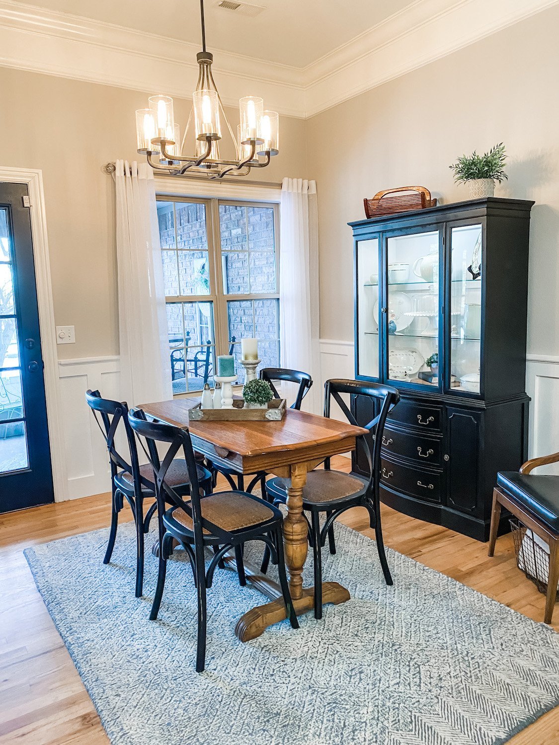
Dining room wainscoting...
I keep thinking I have no more “major” projects to complete around this house…but inevitably I find something I want to do.
The dining room…a tad formalish but we actually use the room more than I thought we would for casual dining.
Like much of this house it has evolved over the last few years….the first Christmas featuring our new table…curtains…the new buffet….all relatively minor.
When we first bought the house the formal dining room was pretty blah…
Right off the entry…first thing you see when you enter the house.
This is the Christmas decor…LOVE! I love decorating this space for holidays and seasons!
As I have shared before, I replaced the arched transoms with rectangular ones, removed all the crown above the doors and windows and changed the light fixtures…all in an attempt to “detraditionalize” the space. It had chair rail and it was obvious it had wallpaper below the chair rail at one time. Before we painted, I had the painter repair some damage from where the wallpaper had been removed and add texture. Then we painted.
For months I have wanted to add wainscoting or SOMETHING to jazz up the space a tad. The only problem I have is that most of the wainscoting inspiration I can find is either really traditional/formal or casual “farmhousey” (like board and batten.) While I have made some changes to detraditionalize the entire space, I don’t want to go super casual. So not formal but not casual.
Don’t get me wrong…I like board and batten wainscoting.
I added it in the breakfast room …
….and entry
…and I love it.
But it just seems a tad too “casual” for a formal dining space.
So…what to do, what to do.
I did what I always do when I am looking for inspiration…cruised Pinterest and the blogisphere.
There are a few issues with this room that will influence what I can do. First, the walls do not go all the way to the ceiling…so in my opinion, I need to keep the wall color above the existing chair rail.
Second, the existing chair rail. I really don’t want to remove it because then I have to do a bunch of sheetrock repair and truthfully, I think I can incorporate it into any design I pick…at least the height of it incase I find another trim i like better.
I know I don’t want to do any picture molding above the existing chair rail…kind of formalish.
I realize I have elements in this room that make it more “formal.” But I want to tone it down a bit.
So far my favorite look is this….
Timisha has a great tutorial HERE for this look.
Easy, relatively inexpensive…kinda formal but not so much that you feel like you have to set out the fine china.
Perfect.
Hopefully next week I can share the finished project!!!


